One of the most important tools in a designer's toolbox is whitespace. Whitespace is just that -- it's space between various content pieces, like paragraphs, headings, buttons and so on. This space can be tweaked to achieve different effects -- such as to separate elements apart from each other by increasing the amount of space or group related things together by tightening it.
It's also one of the things that's easy to mess up if you stop paying attention to it. Here's a segment of the comments section taken from Ryan Holiday's blog:

Can you tell which person made which comment? It's pretty much impossible unless you check the very first comment to see if it has a name label above it or not. The names are posted under the comments in this case. I don't particularly like this flow of content, but it doesn't really matter -- what's important is that we can make this comments section much more readable by tweaking the whitespace between each comment. Here's my redesigned version:

While it's not perfect, it's definitely an improvement. By increasing the space between each comment we've separated them apart -- each comment is a separate piece of content now. I've kept the same space between the name label and the comment text to keep those two things together. Both the text and the name are part of the same comment.
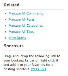
Here's an example from the WordPress admin panel. This is a portion of the sidebar you see when writing new content in WordPress:

It looks pretty good. What's bothering me is the distance between the heading and the content to which it relates to. Look at how far away the word "Shortcuts" is from the text below it. Now look at the distance between it and the links above. The heading is closer to the stuff above it than to the content it's meant to be tied to.
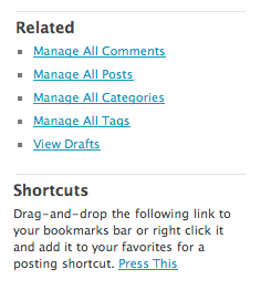
The horizontal line is to blame here, which I don't think adds very much value. Here's my version with the space tightened between the elements:

I've flipped the horizontal divider line above the heading -- it now separates the heading and its content from other content above it. More important, I've decreased the distance between the heading and its content, clearly showing the relationship between those two elements.
Clearly linking together various related bits of content on your page is very important. Your visitors are impatient -- they scan pages. People don't read everything and they don't look at your interface for very long either, so it must be clear at a glance which bits are tied to each other are what bits are separate. Using whitespace to do this is the easiest way to manage these relationships.
Have any examples or thoughts to share? Please leave a comment.