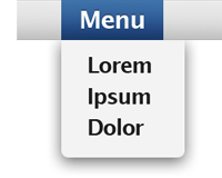
 Application window and menu shadows have been around for a while on the OS desktop. These are the subtle shadows you have around the edges of active and inactive windows, as well as menus. Active windows also normally have stronger shadows to indicate that they are closer to us.
These shadows help reduce the noise of other windows and wallpapers around the active window or menu by darkening them, which in turn makes the active window pop up and stand out at the top.
On contrast, the majority of windows and menus we have in web applications and websites don’t have any shadows. This is because older browsers like Internet Explorer 6 (IE6) don’t support alpha transparency –the feature needed to create transparent shadows, and so developers choose to only implement designs that would work in these older browsers.
Times are changing however, and I think today is a good time to start introducing alpha transparency to sites and applications, especially in cases where it can help improve usability. Yes, IE6 users won’t be able to see this feature, but IE6 is the past – and besides, you can still implement an IE6 specific CSS that won’t show the shadows or other images with alpha transparency.
Let’s look at how adding drop shadows can help make a site more usable. Here’s an example of a drop down menu at The Washington Post website:

The menu is surrounded by just a 1 pixel border. This isn’t ideal because the contents of the menu are very close to the content that’s under it. The menu background has been changed to differentiate it, but there is still a lot of noise around it which steals focus from the menu. We can fix this by adding a nice shadow around the menu:

I think that’s much better. The menu no longer sits on the same plane as the content underneath – it literally pops out. What’s more, the shadow steals the contrast of the stuff around the menu, fading it away and putting all focus on the drop down menu.
Let’s see another example. This is from Amazon:
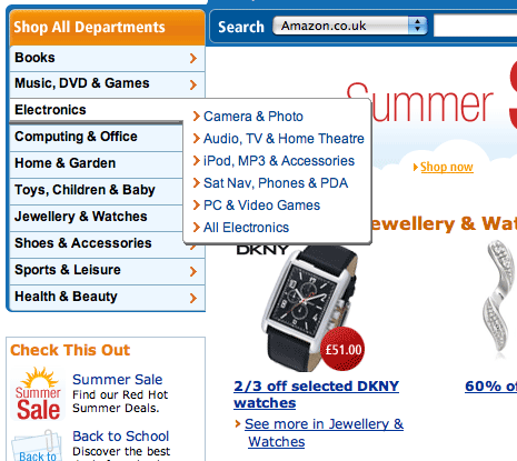
They’ve got a stronger ‘shadow’ on their pop up menu, but it still looks like it sits on the same plane as the content, and the noise is still there. Let’s add a much larger and smoother shadow:
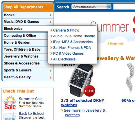
Again, while my implementation is by no means perfect, there is an instant improvement.
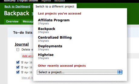
Some websites and web apps have already began to add such shadows to their menus and windows. 37signals have recently implemented a new project switcher in their Basecamp application. The switcher is very usable because it incorporates large click areas as well as a large shadow, which gives the menu area focus and helps eliminate the noise we see around it:
And there you have it. I think shadows are a great tool to help you manage your users’ focus, and they should definitely be utilized more on the web.
EDIT: I’ve written a followup post on implementing drop shadows to windows and menus with CSS