 There’s a very quick usability trick you can do with the links on your site to make them easier to use. It’s something that I don’t see talked about very much, and a lot of sites don’t implement it. Link padding and blocks — that is, increasing the clickable area of your links to make them easier to click on.
Ryan Singer from 37signals has written a very nice article about padding links a while back – and I want to highlight it and add the block dimension because I think it’s an important trick to know. It’s something which will make an instant difference to usability and it’s also a low hanging fruit – it only takes one or two lines of CSS to do.
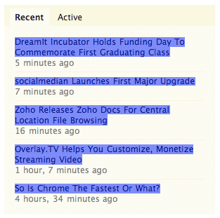
Ok, enough chit chat, let’s see an example. Here’s TechCrunch, one of the biggest blogs in the Web 2.0 tech sphere. On the front page, and on inner pages, they have some content links in the sidebar – a box providing links to the most popular or most recent articles published on the site. Here’s what it looks like:

It’s a simple list of links. The links are all inline elements, which means to select a link you have to click on the text itself. Here are the clickable areas highlighted:
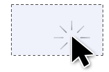
But in this context, we can do much better than that. Each link is sitting in it’s own box, which means we can turn those inline links into block links. This will allow us to fill the clickable area across the whole segment of the box. Here’s a clickable area we want:

This would obviously make it much easier to click on each link because the target area is much bigger –you don’t need to focus the cursor on individual bits of text and instead just move it over the box the link sits in. And since I like to eat my own dog food, I have the same kind of thing on this very site in the sidebar on the right which you can see in action under “Recent Posts”.
The implementation is simple, you just need to turn an inline element into a block. To add more whitespace around the link you should also add some padding. Here’s the CSS code:
.your_link {
  display: block;
  padding: 10px;
}
One nice thing to do is add subtle background color shades when you hover over the link areas to make it clear to the visitor that the link area is clickable, not just the text:
.your_link:hover {
  background-color: #F2F2F2
}
Now – in that TechCrunch example above, they also have a date label of when the post was published. That’s just text, not a link – however I think it would make sense to span the link the whole area as I illustrated above. One way to solve this would be to add the date label inside the anchor tags, and use a span around it for custom formatting. Another way could involve adding some negative margins to the date label box and setting it’s z-index below that of the link block. Obviously you’ll need to make sure the bottom link padding is larger to cover that area as well.
A lot of sites tend to overlook this little trick, but as the implementation is only a couple of lines of CSS code I think this is something we should see more often. All the little polishes you add to your site will add up, and your visitors will appreciate them.
What do you think? Do you use padded and/or block links on your sites? Leave a comment below.