One important element of user interface (UI) design is its aesthetic – the way it looks and feels. But what dictates this cosmetic appearance? One way to design the look of the UI is to infuse it with the feel of the hardware it runs on. Style the UI in the same fashion you create the hardware – give it the same feel and character.
Macintosh and OS X
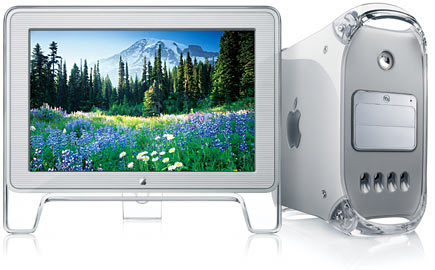
One company that successfully practices this method is Apple. Here’s a picture of a G4 Power Mac with an old Apple Cinema Display next to it:

These were made by Apple several years ago, when they released the OS X operating system. The aesthetic of this product isglossy, transparent plastic, stripes, smooth edges and light grey shades.
This has evolved over the years into the new line of Apple’s products which feature sharper edges and are made mostly of aluminum. Here’s a picture of the current Apple Cinema Display next to the current design of the Mac Pro:

In contrast to the previous aesthetic, this one features darker grey shades, no gloss and simpler edges. What’s interesting is that the operating system, OS X, has also undergone similar evolution in terms of its look and feel. Apple has cleverly designed the cosmetics of the system to match that of the hardware from day one. It doesn’t necessarily have the same elements as the hardware, but it has the same character and the same set of basic traits.
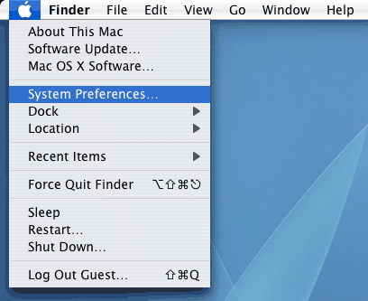
Here’s a picture of the OS X Tiger (older OS) menu bar:

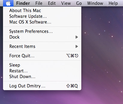
The menu bar is all glossy like the clear plastic the early Mac models were made from and the drop down selection features a familiar striped pattern. Here’s the same menu selection in OS X Leopard, the latest system:

The gloss is gone, replaced by a semi-transparent menu bar. All the stripes are also gone. Here’s a better example – this is a piece of the system preferences window in OS X Tiger:

Shiny buttons on light grey plastic and stripes mimic the feel of the hardware very well. Here’s a piece of the window in OS X Leopard:

Our light grey plastic is replaced with darker grey aluminum. The buttons are also replaced with lighter aluminum and all the stripes are gone. Apple has evolved not only the style of its hardware, but also the style and cosmetic appearance of the software it runs – crafting it in a way that makes it feel at home and integrated.
Does it matter?
Does this synchronization matter at all? I think it does, and I think it’s one of the ways Apple delivers a great user experience to its users. Integrating the UI makes the device feel ‘whole’; you know that the interface has been created specifically for your computer or gadget because it looks and feels like it. If your hardware device has a distinctive style, a UI fashioned to mimic it will only help to reinforce that style.
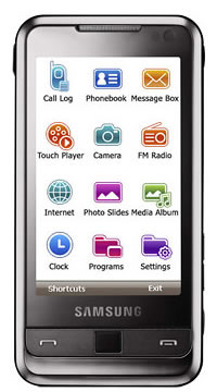
I’ve recently noticed an ad for a new phone from Samsung called Omnia. Here’s what it looks like, together with its UI:

I think there is a clear clash in styles here. The actual hardware features a sleek black brushed metal shell. The UI on the other hand features saturated colors, cartoony icons and a white background. I think this clash creates a problem for the product because it has no distinctive style or soul, just a mishmash of different looking hardware and software. If I worked at Samsung I would redesign the cosmetic side of the Omnia interface to match that of the shell – sleek, black, brushed metal.
Mirror these traits in the UI to give the product a coherent feel. It’s all part of the style, the character and the brand you want to portray. The marketing department makes sure all your promotional material has coherent colors, typefaces and logotypes throughout – that’s part of building a strong identity. In the same vein, I think the fusion of digital UI and physical hardware styles is something that can give a strong identity to your product.
What do you think? Do you think software should look like the hardware it runs on, or maybe it just doesn’t really matter? I’d love to hear your thoughts.