One thing that makes a user interface (UI) great is efficient space utilization. Good designers are able to find elegant ways to lay out buttons, controls and menus on the screen that are able to both, utilize space efficiently and put all the controls where the user would expect them to be.
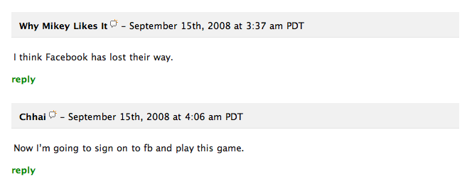
Here’s an example of how a blog interface can utilize space better. This is a small segment of the TechCrunch comments section:

Looks pretty good… however, there’s one thing bugging me here: those reply links. Every comment has a reply link under it; to my eyes it breaks the flow of the commentary. When I’m reading down the page, I read people’s names and then their comments. Those reply links not only get in the way, they also take up a lot of vertical space and stretch out the page longer than it should be.
What’s interesting in this case is that the solution is staring us right in the face. Why not put the reply link in the bar which contains the person’s name and date stamp, floated right? Here’s my mockup:

This makes the UI cleaner. It saves vertical space, making the page length considerably smaller. It also sits next to the name of the person who posted the comment, so there won’t be any confusion as to whom you’re replying to.
When you add new buttons, links and other elements to your interface, have a look around – see if there is space already available somewhere near. Elements that you won’t use most of the time should be put away to the side, out of the way. A lot of the time you’ll find unused space on the right hand side simply because we read and write left to right and so tend to put most stuff on the left. I think little optimizations like this can improve the flow of the page and give the relevant content more focus.