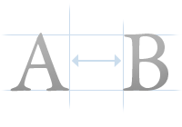
 There is a term used in typography called kerning. Kerning refers to the adjustment of space between letters. Fonts are generally fairly well calibrated by default, but at larger sizes you can begin to see imbalances in spacing between letters.
Kerning is used a lot in the print industry, especially for headlines and logotypes; but it’s something that’s not widely used on the Web because of the lack of control we have over fonts.
But we do have some control. There is a CSS property called letter-spacing which can be used to manage just that – the amount of space between letters. This isn’t true kerning since we cannot tweak individual letters, but it’s better than nothing. For large fonts used in headlines letter-spacing can come in very handy because at larger sizes the gaps between letters are sometimes a little too big.
Let me show you an example. Here’s a sentence written in Arial size 28 pixels font:

Looks pretty good, but I think we can tighten that font a tiny bit. Here’s the same sentence but with a letter-spacing property of -1 pixel applied to it:

I think that looks nicer, especially for headlines. Here’s the CSS code used to achieve this:
#headline {
font-family: Arial;
font-size: 28px;
letter-spacing: -1px;
}
Letter-spacing is something that in my opinion should be utilized more on the Web. If you haven’t tried it out already, give it a go – your headlines will thank you for it.