You’ve built your software or website that performs its function well. You’ve fashioned it with a usable interface that is logical and easy to figure out. You’ve polished the aesthetic so it is enjoyable and satisfying to use. That’s it, you’re done – right? Not quite… because there is one more element you should consider. Responsiveness. How responsive is your interface and your app?
Responsiveness is the quality of providing quick or instant feedback to the user that something is happening or that their action is working. We all know when the software isn’t responsive; you click a button, and nothing happens – the application just hangs there. Slow loading webpages, laggy javascript and sluggish application controls are all the symptoms of unresponsive software or website.
Sure, this is partly governed by how fast the user’s computer is – but it is also something that you have control over. You can optimize your code and streamline your application to load faster and perform faster.
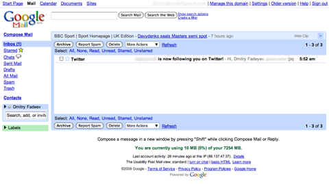
Look at Google’s suite of web applications. Every single one of them features the minimalist user interface that we’ve grown accustomed to from using their search. They didn’t pick minimalism simply to make the site easier to use – they could achieve the same thing and use visual polishes as well, like Apple’s MobileMe web application for example. They go for minimalism because it also makes the app load faster. Less images means less stuff to download, which means the user gets a more responsive experience and Google saves on bandwidth. Indeed, Google’s third philosophy is “Fast is better than slow”.
The minimalist Gmail UI:

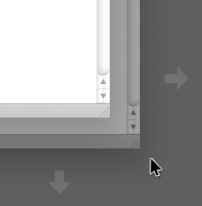
Lets see another example. Lets look at the two popular operating systems, Windows and Mac OS X. Windows actually has more responsive windows that OS X. When you open an application window, such as a browser, and then proceed to resize it, the OS X mouse cursor actually races ahead of the window edge and the window itself struggles to catch up, all the time re-rending the content inside it to fit the different sizes.
Here’s an illustration. It’s kinda hard to show what happens – but basically the window itself fails to keep up with the cursor if there’s a lot of complex content there. It’s very subtle but noticeable:

It’s not very problematic, but it’s still something which affects my perception of how responsive the system is. This doesn’t happen in Windows where the edge of the window moves exactly in sync with the mouse cursor. This makes the system feel really snappy and responsive.
Can responsiveness be faked? Possibly. I noticed a spinning circle graphic used in the Apple Mail app on the Mac, which is used to tell the user that the application is working or loading something, has been sped up in the Leopard release of OS X. Now, I doubt the actual animation is linked to how fast the process is working – I could be wrong – but in any way, the faster loading graphic gives an impression of a faster system and a snappier application. It “feels” faster.
When you build your site or your app, consider carefully if you need all those images and visual resources. Optimizing your code to make your product responsive will affect usability. People want things to work quickly and sluggish interfaces don’t make for a satisfying experience.