A colleague of mine was recently trying to cut down on image usage when working on a web design project. He asked me whether it was possible to use one image for a vertically scalable content box that had both, a unique heading background, a border along the sides and a rounded off border in the footer.
I didn’t think about it very much and dismissed it as impossible or too fiddly. I’ve been thinking about it for a little bit now and realize I was wrong and there is actually a very easy way to do this. Whether the method is practical or not for production use I’m not sure – but at least this is something that can be done. Let me demonstrate how…
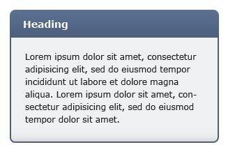
Let’s say we designed the following content box in Photoshop to be used in the sidebar of a website:

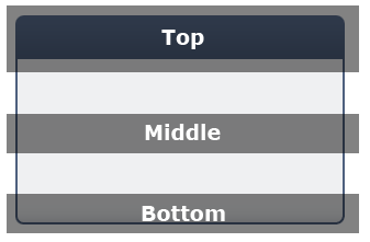
Not an unlikely example. The box above has three unique sections, the header at the top, the middle area which repeats itself, and a bottom section with the rounded off corners and a slight shadow.

One of the traditional ways of coding such a box would be to slice it into three images for each corresponding part (the middle section would just be a 1 pixel high image, since it’s to be repeated) and then apply them to three individual sections of the HTML. However, we want to use just one image, so we’re not going to cut anything up.
We do however, need to make sure the image is high enough to support scaling vertically – so the image I’m making is 1000 pixels in height. For real usage you may even make it higher than that. This part of the implementation is what puts me off – it doesn’t feel right to make such huge images – but for the sake of getting this implemented, let’s carry on. Oh, I must also note that making 1000 or 10000 pixel high images won’t really affect the file size very much since the middle part is repeating itself (at least using PNG compression).
Ok, so you’ve got the same image as above, except very tall. What next? Next we’re going to implement the HTML. Here’s what the markup might look like:
<div class="content_box">
<h2>Heading</h2>
<p>Some text here...</p>
</div>
Nothing out of the ordinary here. We’ve got the div holding the contents together, a heading at the top and then followed by a paragraph or two of text. To use one image on this markup we simply need to apply it as a background image to both, he parent div, and also the heading. The difference is that the parent div will have the background positioned to the bottom, and the heading to the top. As the content inside the div expands, the background will slide out under the heading image to reveal more. Here’s the CSS (I’ve added some padding and styling specific to my example above):
.content_box {
width: 300px;
background: url(background.png) bottom;
padding-bottom: 3px;
}
.content_box h2 {
background: url(background.png) top;
padding: 9px 15px;
color: #FFF;
font-size: 0.84em;
}
.content_box p {
padding: 0 16px;
font-size: 0.75em;
color: #222;
}
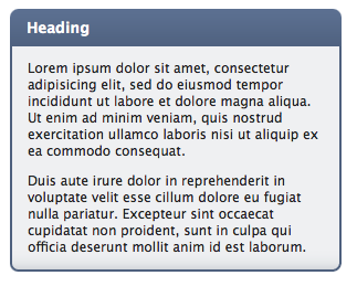
That’s it. The final styled result will look something like this (above example in Safari):

And there you go – scalable content boxes using just one image. Grab the full source code to the example above here.
Is it practical? I’m not sure. For one thing there will always be a limit to how far the image will scale, since that will be dictated by the image height. Another thing is that this method doesn’t feel right – it’s a hack. Having said this, the alternatives are only a little less hacky, since we have to slice up images into parts – that’s not ideal either.
What do you think? Post a comment below.
Update [28 Nov 2008]: Sebastian has posted a better solution in the comments. His method utilizes left and right positioning as well as top and bottom, enabling us to cut down the image size drastically. In-fact, his solution looks practical for production use. Here’s the live demo + background image used. Just look at the image and the markup and the method will instantly become apparent. Thanks Sebastian :)