I find that when you’re working on a web design – or even any other project involving typography and layout – it helps to squint or look at your design from a distance. What you want to do is to squint or go far away that the content would start blurring.
When content pieces blur together you begin to see how whitespace separates them into sections and groups. You can’t read the text itself, but you can see groups of text and the various sections that you’ve laid out.
Well… that’s what you want to see. If you see one big mess then it means your whitespace (the empty space between elements) isn’t doing its job.
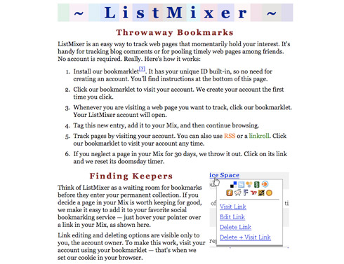
Let me illustrate this with an example. Here’s a site (Listmixer) where whitespace usage could be improved:

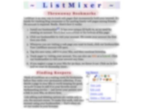
If you squint hard enough so that the contents begin to blur we’ll get something like this:

Two big blobs of text. This means that too much text is grouped up. Ideally you want to break things down into small bite size chunks that impatient visitors can swallow quickly. When there’s too much to read, these visitors may just give up and leave.
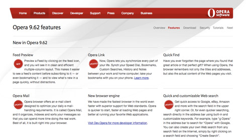
Here’s a better example of whitespace usage on the Opera browser’s features page:

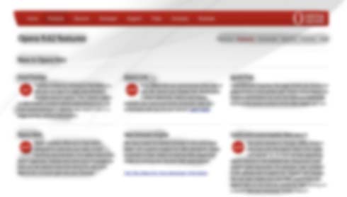
If we squint we get this:

The text groups itself into smaller blobs that are clearly separate from each other. The whitespace here is sufficient and does its job well at separating content and giving each bit of text enough breathing room.
Sometimes it also helps to do this to a visual layout to see how its aesthetic works – see what the overall feel the design emanates. When your design is featured on thumbnails in CSS galleries or other blog posts, the design may be reduced to a small size that begins to blur the contents. What will it look like then? Is there a unique pattern, shape, and color theme that remains even when the design reduced to a blur?
Taking a step back also allows you to see what a new visitor may make of your design. They don’t know what each bit of the site is or what the text says because they haven’t read it yet – they see one big page with various elements. What will they focus on first? What attracts attention? I find the method above lets you get a feel for what elements pop out of the page and how well whitespace works at separating those elements apart.