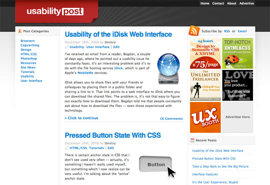
Just updated the UsabilityPost design. The old design, while perfectly usable, felt a little bland and boring. I could have made further updates to it, but I felt the basic structure and feel wasn’t right. So here we have a new redesign from scratch which I’ll be improving over the coming weeks. I really like how it’s turned out – incorporating bits of eye candy, yet keeping things simple. It’s also a lot more like the original design I started off with when the blog first launched.
Anyhow, here’s a shot of the old design if you’d like to see the difference (click to enlarge):
Some readers have asked me for a better way to browse the archives. While it’s not up yet, a proper archives page and a popular posts lists are on their way. I’ll be interested to read your thoughts about the new design – what do you think? Post a comment.
