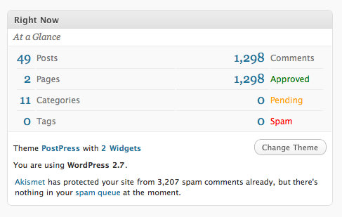
There is a curious design element in the new WordPress 2.7 admin dashboard. The ‘Right Now’ box shows a collection of latest statistics about your blog, such as the totals of all your posts, categories, tags, comments, spam and so on. Here’s what it looks like:

Now, the left columns isn’t actually related to the right. The left deals with the totals of all posts on your blog. The right deals with comments. Yet for some reason they’re placed side by side and each element has a line under it, spanning the whole width of the container. This results in pairs of statistics.
When I first saw this I was trying to figure out why the posts total was related to the comments total and why the 0 tags bit was next to the 0 comments bit. Of course there was no relation at all. The underline is used to separate each number, but for some reason the designer decided to span it the whole width, connecting the two separate statistics in the process.
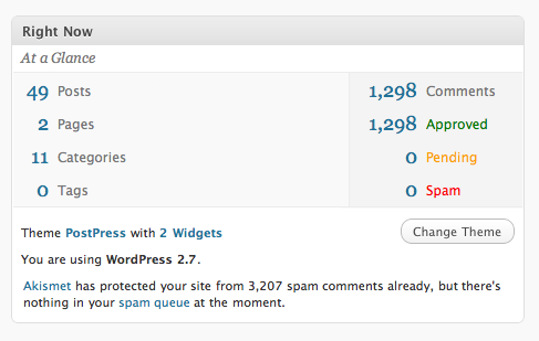
This is confusing and should definitely be split up. Here’s a quick mockup I prepared earlier:

Not perfect, but already it’s easier to see the two separate groups.
Overall, I really like the new WordPress 2.7 interface. It’s not only better organized, but it’s also a little bit more polished, which gives a better user experience. Anyone else running 2.7? What do you think of the new UI?