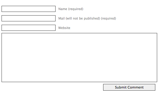
A UsabilityPost reader, Vadim, has raised an interesting issue regarding comment form design. He saw that some forms around the net had two fields labeled as required – the name and the email. Comment forms usually have two more fields in addition to this: the website and of course the actual comment. Here’s what this looks like:

Vadim mentioned that he noticed something curious in a popular blog post with hundreds of comments. That blog post had the very comment input form you see in my above screenshot. He noticed that some of the people replying to the post had left “none” or “n/a” as their website.
The website field isn’t required, but it was obviously mistakenly confused to be so. The two fields above: the name and the email are labeled as required, but everything else isn’t. This is a little confusing as obviously the comment is required also, but the form assumes you’re smart enough to work that out.
Good comment form design
What would be the ideal comment form design?
UX Matters has a very good article about label placement in forms. The findings published are based on an eye-tracking study, so the recommendations provided are fairly authoritative.
To summarize… the conclusions were that you should place labels above the input fields because this minimizes the distance your eye has to travel from the label to the input field. If you place them on the left of input fields, at least right align them – again, to cut the distance. Bold fonts didn’t perform well, though there were some doubts about what could have caused this.
So the ideal comment form has the labels placed close to the input field, preferably above it. But what about the actual order of the fields. Most forms start with name, followed by email, followed by website, followed by comment. Pretty much all blogs and sites implement this same setup for their comment form. I’d like to question whether this is the right approach.
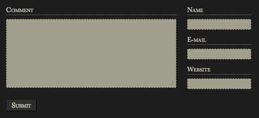
A friend of mine has implemented different layout for the comment form. Here it is:

This challenges the standard comment form flow by putting the comment input field first, followed by author’s details. This way you can say what you have to say, and then sign the comment. People write letters in this order. You write the content of your letter first, and then you sign it. I think it would make more sense for the comment form to also flow like this.
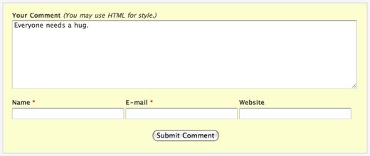
Of course, this form isn’t ideal either because the visitors have to look right of the page to fill their name and email, and then back left to find the submit button. Here’s a setup that in my opinion is even better. It’s a form used on the Particletree blog:

Pretty good. We’ve got the comment field first. Then at the bottom we’ve got author detail fields. Labels are close to the fields and are placed above them as recommended by UX Matters. The submit button then follows the flow and is placed below all the fields, in the center. Required fields are indicated by a red star.
I may try this setup with the contact form here on UsabilityPost.
What do you think? Do you think the popular comment form setup works, or do you like my suggestion of changing the field order? I’d love to read your thoughts.