There is a lot of information out there about various interface design techniques and patterns you can use when crafting your user interfaces and websites, solutions to common problems and general usability recommendations. Following guidelines from experts will likely lead you towards creating a good user interface – but what exactly is a good interface? What are the characteristics of an effective user interface?
Here are 8 things I consider a good user interface needs to be:
Lets take a closer look at each.
1. Clear
Clarity is the most important element of user interface design. Indeed, the whole purpose of user interface design is to enable people to interact with your system by communicating meaning and function. If people can’t figure out how your application works or where to go on your website they’ll get confused and frustrated.

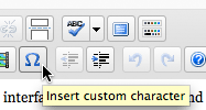
What does that do? Hover over buttons in WordPress and a tooltip will pop up explaining their functions.
2. Concise
Clarity in a user interface is great, however, you should be careful not to fall into the trap of over-clarifying. It is easy to add definitions and explanations, but every time you do that you add mass. Your interface grows. Add too many explanations and your users will have to spend too much time reading through them.
Keep things clear but also keep things concise. When you can explain a feature in one sentence instead of three, do it. When you can label an item with one word instead of two, do it. Save the valuable time of your users by keeping things concise. Keeping things clear and concise at the same time isn’t easy and takes time and effort to achieve, but the rewards are great.
![]()
The volume controls in OS X use little icons to show each side of the scale from low to high.
3. Familiar
Many designers strive to make their interfaces ‘intuitive’. But what does intuitive really mean? It means something that can be naturally and instinctively understood and comprehended. But how can you make something intuitive? You do it by making it ‘familiar’.
Familiar is just that: something which appears like something else you’ve encountered before. When you’re familiar with something, you know how it behaves – you know what to expect. Identify things that are familiar to your users and integrate them into your user interface.

GoPlan's tabbed interface. Tabs are familiar because they mimic tabs on folders. You figure out that clicking on a tab will navigate you to that section and that the rest of the tabs will remain there for further navigation.
4. Responsive
Responsive means a couple of things. First of all, responsive means fast. The interface, if not the software behind it, should work fast. Waiting for things to load and using laggy and slow interfaces is frustrating. Seeing things load quickly, or at the very least, an interface that loads quickly (even if the content is yet to catch up) improves the user experience.
Responsive also means the interface provides some form of feedback. The interface should talk back to the user to inform them about what’s happening. Have you pressed that button successfully? How would you know? The button should display a ‘pressed’ state to give that feedback. Perhaps the button text could change to “Loading…” and it’s state disabled. Is the software stuck or is the content loading? Play a spinning wheel or show a progress bar to keep the user in the loop.

Instead of gradually loading the page, Gmail shows a progress bar when you first go to your inbox. This allows for the whole page to be shown instantly once everything is ready.
5. Consistent
Now, I’ve talked before about the importance of context and how it should guide your design decisions. I think that adapting to any given context is smart, however, there is still a level of consistency that an interface should maintain throughout.
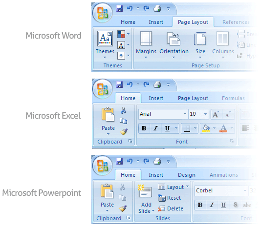
Consistent interfaces allow users to develop usage patterns – they’ll learn what the different buttons, tabs, icons and other interface elements look like and will recognize them and realize what they do in different contexts. They’ll also learn how certain things work, and will be able to work out how to operate new features quicker, extrapolating from those previous experiences.

The Microsoft Office user interface is consistent for a reason.
6. Attractive
This one may be a little controversial but I believe a good interface should be attractive. Attractive in a sense that it makes the use of that interface enjoyable. Yes, you can make your UI simple, easy to use, efficient and responsive, and it will do its job well – but if you can go that extra step further and make it attractive, then you will make the experience of using that interface truly satisfying. When your software is pleasant to use, your customers or staff will not simply be using it – they’ll look forward to using it.
There are of course many different types of software and websites, all produced for different markets and audiences. What looks ‘good’ for any one particular audience will vary. This means that you should fashion the look and feel of your interface for your audience. Also, aesthetics should be used in moderation and to reinforce function. Adding a level of polish to the interface is different to loading it with superfluous eye-candy.

Google are known for their minimalist interfaces that focus on function over form, yet they clearly spent time polishing off the Chrome user interface elements like buttons and icons to make them look just right as evident by the subtle gradients and pixel thin highlights.
7. Efficient
A user interface is the vehicle that takes you places. Those places are the different functions of the software application or website. A good interface should allow you to perform those functions faster and with less effort. Now, ‘efficient’ sounds like a fairly vague attribute – if you combine all of the other things on this list, surely the interface will end up being efficient? Almost, but not quite.
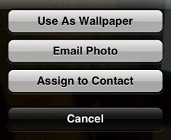
What you really really need to do to make an interface efficient is to figure out what exactly the user is trying to achieve, and then let them do exactly that without any fuss. You have to identify how your application should ‘work’ – what functions does it need to have, what are the goals you’re trying to achieve? Implement an interface that lets people easily accomplish what they want instead of simply implementing access to a list of features.

Apple has identified three key things people want to do with photos on their iPhone, and provides buttons to accomplish each of them in the photo controls.
8. Forgiving
Nobody is perfect, and people are bound to make mistakes when using your software or website. How well you can handle those mistakes will be an important indicator of your software’s quality. Don’t punish the user – build a forgiving interface to remedy issues that come up.
A forgiving interface is one that can save your users from costly mistakes. For example, if someone deletes an important piece of information, can they easily retrieve it or undo this action? When someone navigates to a broken or nonexistent page on your website, what do they see? Are they greeted with a cryptic error or do they get a helpful list of alternative destinations?
![]()
Trashed the wrong email by mistake? Gmail lets you quickly undo your last action.
To conclude...
Working on achieving some of these characteristics may actually clash with working on others. For example, by trying make an interface clear, you may be adding too many descriptions and explanations, that end up making the whole thing big and bulky. Cutting stuff out in an effort to make things concise may have the opposite effect of making things ambiguous. Achieving a perfect balance takes skill and time, and each solution will depend on a case by case basis.
What do you think? Do you disagree with any of these characteristics or have any more to add? I’d love to read your comments.