 If we look at interfaces in operating systems, we’ll see that there is usually a set of unified interface elements that’s shared not only by the operating system’s own tools, but also by third party programs running on that operating system.
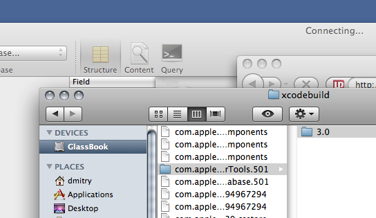
For example, Apple’s OS X had a UI called “Aqua” for quite a few years now that gave the buttons and other interface elements a certain look a feel – a liquid look for the buttons and a more metallic/plastic look for the texture of the windows themselves. They’re now moving towards a more aluminum look that will bring it closer to the look and feel of their hardware products.
Until OS X Leopard, there were actually several ‘branches’ of the UI spread around Aqua. There were the plastic windows, the brushes metal windows and the darker aluminum windows. Buttons looked different in each one of these ‘styles’. Leopard, the latest release of OS X, has unified the look across the board.

The interface in OS X looks the same on (almost) every app
Companies making apps for OS X don’t reinvent the wheel and go with the toolset given to them by Apple, so the UI in their apps looks and feels like that of OS X. The same thing on Windows – Windows XP may look different to Vista and 7, but the apps running on each system tend to use the interface elements provided by the OS, so they fit in and feel ‘native’ to the system. Well… most apps do – some don’t, and choose to fashion their interface with a completely unique look.
Why’s a unified interface important? The main argument is that people learn what each interface element looks like – what a button looks like, what a tab looks like, what a scrollbar looks like, and so on. With a unified interface you only need to learn this element once. If every other tool or third party app on the system then re-uses the same graphics and styles, the user can easily recall the function of that element. It also just looks good to have a consistent style across the board. It’s clear and orderly.
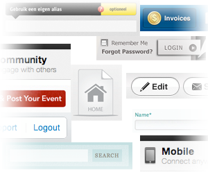
That’s the situation on the desktop OS at least – it’s mostly unified, with a few exceptions. On the web though, it’s a different story. CSS allows us to style interface elements displayed inside a browser – things like form input fields, buttons and navigation menus. Without any styling, these elements take on the look of the operating system the browser is running under – or even that of the custom styles provided by the browser itself.
A lot of web applications style their elements with CSS. A lot of others just leave them as they are. Using the same, un-styled, application then on different computers and on different browsers will give you a different experience. UI elements will look different each time. You might even get different fonts, depending on what fonts you have installed on that particular computer or device.
Using styled applications is another story. The interface remains consistent across different computers (more or less). Each styled application looks different from other styled applications though because the developers create their look themselves from scratch every time. There is no consistency – you have to learn the interface when you begin using the app.
This leads me to the question of the post: should there be a unified set of styles for web interfaces?
Just as Apple has consolidated their shattered OS look and feel in Tiger with their unified interface in Leopard, it’s possible to unify the look of interfaces of the web with CSS. Not just a framework – but a set of carefully crafted and good looking styles for forms, menus and windows that would remain consistent across devices and browsers. Such a stylesheet will give developers a strong foundation on which to design their app, and will provide a consistent experience for all the users of the apps sharing these styles.
Why now and how?
The reason why I bring up this topic is because an adoption of a certain technology is beginning to grow. That technology is CSS3. While CSS3 is still not fully supported by the browsers, all of the modern browsers support some of the common elements of it. These advanced styling properties allow for things like rounded corners, box shadows and text shadows, allowing the designer to create beautiful interface elements without resulting to many images (or indeed, any images).
More important, these advanced properties do away with useless markup bloat which was essential for things like rounded corners. With CSS3 you can style HTML elements without additional markup – just target each element directly and apply the advanced properties.
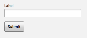
Here’s an example of two inputs, a text input and a submit input, that I’ve styled earlier. The markup for both elements is pure – no wrapping divs or custom classes – the CSS targets each by type – e.g. input[type=text]. This will look the same in all modern browsers across different operating systems (the font may differ slightly as it falls back to the next available one):

Text field and a submit button styled with CSS3
Now.. Internet Explorer 6 doesn’t support these kinds of type selectors – or any other advanced CSS3 properties for that matter. Newer Explorers support type selectors but won’t give you the fancy stuff like rounded corners or shadows (although this stuff should degrade gracefully because after all, sharp corners aren’t the end of the world as long as everything else functions properly).
The other modern browsers support enough right now to start styling buttons and other interface elements without additional markup though.
So it’s possible to make a comprehensive CSS that will provide attractive, and more importantly, unified styles to form elements and menubars (which will need minimal markup and classes, specified by the stylesheet) – but is this a good idea? This is a project I’d like to do but I’m wondering whether it’s worth it. I’d love to read your comments.