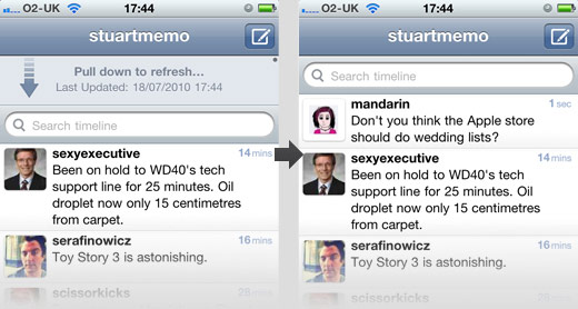
Earlier this year, Twitter released its very first official client for the iPhone. Instead of developing the product internally, they discreetly bought the rights to an existing app called Tweetie. They then hired its developer Loren Brichter, and re-branded the app simply as “Twitter”.
So what made Tweetie so special? Well, features and functionality aside, the one thing that most users fell in love with was its UI; simple and intuitive, all the things a good interface should be. What really got us usability nerds talking though was the use of a gesture to download your latest unread tweets. Instead of the standard tap to refresh button you’ll find in most Twitter clients, Twitter (as I’ll now refer to it in present tense) requires you to pull the tweet-list downward with your thumb then snap it back like a piece of elastic. Once you’ve done this, the app contacts the Twitter servers and displays your most recent unseens tweets.

On the surface, this may seem like a novelty to differentiate it from other Twitter clients, but it actually helps reduce UI clutter while removing the need to worry about whether the user will manage to hit a button’s potentially small target area. Oh, and it also makes a satisfying “pop” sound when you snap the list back into position. What’s really interesting about all this though is that while the reason to perform the gesture is new (refreshing the current view), the gesture itself is old and therefore feels extremely natural.
So, where have we seen this gesture before? Well, it’s pretty much used in every app on the app store that involves browsing any sort of list. The user will perform this same pull down and release action with his or her thumb when scrolling quickly through such a list. The small piece of genius with the Twitter app however is that once the user scrolls to the top of the list to read the most recent tweet, they can simply keep on going, pulling down yet again–only this time the latest unread tweets will be delivered from the server, without any fiddly button pressing. It’s also worth mentioning that this snapping of elastic isn’t new to the iPhone either; try scrolling too far on a web page in Safari, you’ll be quickly bounced back to the end of the page.
Pop goes the App Store
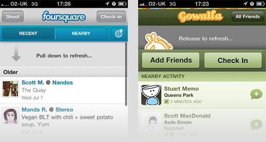
Recently, this slide to refresh feature has made an appearance in numerous iPhone applications, such as location-sharing services such as Foursquare and Gowalla. Both implement the concept in pretty much the same way, using it as a nicer alternative to the refresh button.

It’s great to see people like Loren thinking hard about the potential usability benefits a touch screen device brings, instead of lazily porting over old UI elements from the now aging point and click era.