 The image on the right is a snapshot of a portion of Gandi’s website, a domain registrar I use. The website uses boxes and borders to structure content, and it works fairly well. The problem is, there are areas of the site where all the boxes and borders converge, forming areas of border overkill.
At the bottom there you can see about 5 borders packed together in a row. Yes, grouping related items together is good to show hierarchy and relationships, but sometimes you get carried away. Let’s call this a mild case of borderitis.
Here’s what the bottom area looks like in full width:
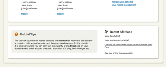
There’s quite a few things going on here. There are a couple content sections, both wrapped inside a container. Inside the bottom content section there’s also another box for “Helpful Hints”. Here are just the borders:

I think this can be simplified without losing any information. First of all, we can probably remove the outer wrapper because it doesn’t serve much purpose (it does flow into a navigation at the top, but there are ways to get that to work without the wrapper being required to go all around the content).
We can also get rid of the box around “Helpful Hints” and simple separate it with one full height border from the content on the right. I wouldn’t merge the two content boxes (top and bottom) because the stuff inside is fairly different so it benefits from this extra separation. Here’s what we get:

Much cleaner. Here’s what it could look like on the actual site:
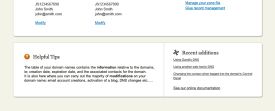
Our borderitis problem is resolved with just a couple of tweaks. Oftentimes you can simply take away a bounding box and separate the area from other content with a single border, making the interface lighter and less cluttered. Sometimes you don’t even need a border at all, just separate the content with plenty of white space.