Book review
The Design of Everyday Things by Donald A. Norman
 When I set off to write a book review I try to make the review itself valuable even if the reader doesn’t end up reading the book by taking and explaining some of the more interesting and useful ideas. The Design of Everyday Things makes this task very difficult because of the sheer amount of concepts and their interconnectedness that Norman presents.
Even though the book was first published in 1988 and so focuses more on the design of physical things like water faucets, doors and clocks, the ideas presented are directly applicable today in the design of software interfaces and websites. Indeed, as Norman points out, they are even more applicable because the digital interfaces gives us a lot more freedom to work with.
The book was originally titled “The Psychology of Everyday Things”, with the word ‘psychology’ later swapped for ‘design’. This gives us a first clue about what the book is really about. I think both titles are equally applicable because Norman goes into both, the theory of how people behave when working with everyday objects and the practice of making use of these findings by giving us a list of guidelines to follow.
Who is guilty?
There is a running theme throughout the book that deals with blame; more specifically, who is to blame for misuse, misunderstanding or errors when using everyday (and not everyday) objects and devices? The user of the device often assumes blame by default. They believe that because they were the ones that made the error, or they were the ones who couldn’t figure how the thing works, then they’re the ones to blame.
Norman argues that in most cases this isn’t so. The designer is to blame because they produced something that’s not easy to understand or something that lets errors and misuse happen. If we have trouble using something then it’s probably because that thing is badly designed, rather than us being stupid.
This is an important concept to take in because it sits at the core of the process of designing usable products. The designer isn’t there to merely produce something to spec, or something that they would want to use themselves–the designer is there to guide the user through the experience from the first moment that person sees the device or a piece of software.
The designer’s job is to communicate what the device or a piece of software can do, and how the user can go about using those features. The flow of interactions should also be designed in a way that minimizes room for error. The interface should guide the user through the use of the device and protect them from straying aside and bumping into errors. Failure to do this results in products that are confusing and frustrating to use.
What are they thinking?
So how do you go about designing a better product? The first thing you should think about is what goes on in the head of your users when they first see your product. In this first moment the user will begin forming a conceptual model of how the thing in front of them works–i.e. what can you do with it and how?
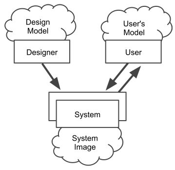
The diagram above (adapted from the book) shows this process. First of all the designer comes up with a conceptual model–this is the design model, and that’s how the designer intends the device or software to work. The only way to communicate this model with the user is to implement it through the interface, which forms the system image. The user then interacts with the system image and creates their own mental model of how the thing works.
Because the designer cannot directly communicate with the user to tell them about how they intended the device to work, all efforts should be put into creating a system image that clearly communicates its purpose and the way it works to the end user–in other words, make the interface easy to understand and use. Failure to do this results in wrong mental models on the user side, which leads to confusion and errors because the user is trying to operate the device in the way the designer did not intend.
Now…it’s easy for me to say “make it easy to understand”, but how does one actually do that? The designer always has a few powerful tools at their disposal, so let’s take a look at what they are.
Natural Mapping
Mapping is the relationship between two things. In the case of interface design it’s the relationship between a control and its resulting function. For example, a rotating volume control may have a mapping of clockwise rotation to increase volume, and anti-clockwise to decrease.
To create more effective interfaces we need to exploit what’s known as natural mapping. Norman defines it as follows:
Natural mapping, by which I mean taking advantage of physical analogies and cultural standards, leads to immediate understanding. For example, a designer can use spatial analogy: to move an object up, move the control up. To control an array of lights, arrange the controls in the same pattern as the lights. Some natural mappings are cultural or biological, as in the universal standard that a rising level represents more, a diminishing level, less. Similarly, a louder sound can mean a greater amount.
There’s a nice example of stove controls that illustrates this perfectly. A lot of stove controls have the controls arrangement completely detached from the arrangement of the burners. It might look something like this (diagram adapted from the book):
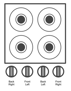
The mappings are not great because the controls don’t represent the alignment of the burners, so you always have to refer to the labels when you want to turn them on or off. We can improve this by using a natural mapping, using a spacial analogy to show the relationship between the controls and the burners they operate:
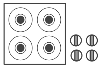
It’s now obvious which control operates which burner because their layout maps directly to the layout of the burners. With such a natural mapping you no longer even need labels. Yes, there is a downside with this example, it takes more space because it doesn’t neatly line up by the side of the burners, but what would you rather have, a more compact tool or something that’s much easier to use?
Perceived Affordances
Another concept Norman introduces is that of affordances, or more specifically, perceived affordances. Perceived affordances are the actions that you perceive to be able to do with a device or object–i.e. how do I go about using this thing? Do I operate it like this by pulling this lever, or do I twist it? The construction and design of the interface will produce different perceived affordances, for example, a button that looks like a button will send the message to the user that it’s meant to be pressed down.
A nice example of this are doors. Most doors turn only one way so they have two sides: one where you pull, and one where you push. If both sides look the same, confusion happens. People pull the side from which they are meant to push and vice versa. To remedy this, people put up big labels that say “Push” and “Pull” on either side. But that’s far from an elegant solution.
You see, both sides don’t have to look the same. The pull side can have a handle, the other side can have a big metal plate or a push bar. A handle sends out a signal: grab me and pull. A metal plate cannot be pulled, so you have only one option: push. Designing each side of the door appropriately eliminates confusion because the perceived affordances are now more focused on the intended action.
Feedback
When the user does something, it’s important to give feedback–show them what’s just happened.
Without feedback, one is always wondering whether anything has happened. Maybe the button wasn’t pushed hard enough; maybe the machine has stopped working; maybe it is doing the wrong thing. Without feedback, we turn equipment off at improper times or restart unnecessarily, losing all our recent work. Or we repeat the command and end up having the operation done twice, often to our detriment.
Norman gives the example of his felt-tipped pen. One side of the pen has a set of ribs, a subtle physical cue. Holding the marker with the ribbed side up results in the marker writing better. If you do hold it the other way, nothing bad would happen, but the marker won’t write as well. The ribs along the side are a subtle cue on how to hold the marker–they provide unobtrusive feedback to the user as they work.
The same things can be applied today in the design of digital interfaces. Whenever the user adds something, like a new task on a to-do list, that task should be highlighted in some way to let them know their action was successful. Not doing it may result in the user not noticing the results of their action and assuming nothing happened.
If clicking a button or link does not result in immediate change, the button text should change to inform the user the application is loading. Another way to do it is to show a little spinning animation by the side, informing the user that a process is happening. Or indeed, you can do both, change the text to say “Loading…” and show the little loading animation. Now, rather than staring at the same browser window, the user will know that their action has been registered and something is happening.
###Constraints
The best way to prevent errors is not let them happen in the first place. This can be done using something called forcing functions. Norman describes forcing functions as follows:
Forcing functions are a form of physical constraint: situations in which the actions are constrained so that failure at one stage prevents the next step from happening. Starting a car has a forcing function associated with it–you must put the ignition key into the ignition switch. Some time ago, the button that activated the starter motor was separate from the ignition key, so that it was possible to attempt to start the car without keys; the error was made frequently. In most modern automobiles, the starter switch is activated by turning the key–an effective forcing function that makes you use the key to do the operation.
Forcing functions are a great way of preventing errors, but you have to be very careful when designing them since it’s all too easy to force something on the user that they may not actually want. Think about edge cases and decide whether the constraint will ultimately make sense or not.
Sometimes forcing functions can save lives. Here’s an example of a lockout, a device that prevents someone from entering a dangerous area or performing an unwanted action:
In the building in which I work, at the ground floor the stairs seem to end, leading directly to the building’s exit door. To go down further requires finding a different door, opening it, and proceeding down the stairs. This safety feature is usually a nuisance: we have never had a fire, yet I frequently must go from a higher floor into the basement. It’s a minor nuisance, however, and it is worth the cost if it can save lives where there is a fire.
In a similar fashion, a lockin keeps an operation going. For example, a button to close an application that doesn’t actually do it immediately, just begins the process so that no data is lost. An interlock forces an operation to take place in a certain order, for example, a design of a TV set that instantly disconnects power when the back door is opened, ensuring this operation is not done when the power is still on.
Final words
If you’ve made it this far then you’re probably interested in what else the book has to offer, and you should, because The Design of Everyday Things is a must read for every designer, whether you’re working on physical objects or digital websites.
I could go into more depth but that would defeat the purpose of giving you an overview of the contents of the book. The examples above are just some of the many featured in the book, and Norman goes into much more detail on each of the above sections, as well as covering many more related concepts. Even though the book was written a fair few years ago and focuses more on physical objects rather than digital interfaces of today, the ideas and concepts can and should be applied today in the design of our websites and web applications. Highly recommended.