Apple’s latest update to their Mac operating system, OS X Lion, brings with it a few user interface tweaks. Here are 4 methods I’ve noticed that Lion uses to make its interface appear simpler. (If you’re interested, you can find more screenshots here from the developer preview release)
Weaker button separators
Here’s a simple effect that simplifies the feel of double buttons. Take the forward and back buttons in Finder. They’re a double button–two buttons that are merged together on one edge. In Lion, the edge separating them has been turned into a line that does not span the whole height of the button:
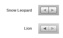
It’s still a separator, but it has been weakened. The border around the buttons seems to have been toned down a little, too. I think it’s a nice change; it brings the content of the button forward (the icons or labels) and makes the thing feel simpler in the case of double button because now it looks more like one element rather than two.
Fewer buttons
Here’s an example from iCal: the set of buttons that let you choose the display mode (day, week, month etc). Before, we have just a set of buttons merged together. They’re more like switches because when you select a different mode the old one will deactivate, meaning only one option can be selected at any time.
In Lion, these buttons are removed, showing just a sort of groove with the set of labels (or icons):

The currently selected mode is the only one that looks like a button. It’s not really a button though–in effect it’s more like a sliding switch that you can move left and right over the mode you want–at least that’s what the physical metaphor appears like to me.
It definitely looks simpler and lighter than the previous iteration. The metaphor also makes more sense, although the currently active indicator looks too much like a button, making it look like the only clickable thing.
Less color
iTunes was first to go monochrome, and now Lion is following in its footsteps. Things like the color icons in the sidebar in Finder are now monochrome:
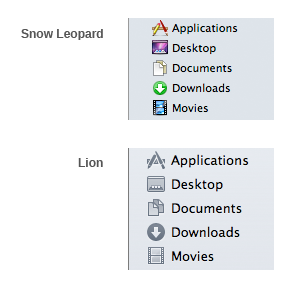
Another move to make the interface take a step back and bring user content forward. Giving up color cues almost certainly makes it less usable, so what’s gained? A nicer looking interface that feels simpler because it fades away into the background, presenting you with less information to process.
Hard to judge whether it’s worth it, we’ll just have to wait and see, but I personally found their last iteration (the one where they made the different folders like Movies, Pictures, Library etc., monochrome, with just an engraved icon) made navigation more difficult.
Hidden scrollbars
A lot of the apps now seem to have the same invisible scrollbar that is used in iPhones and iPods. When you scroll, it will show up a subtle scroll indicator on the right edge of the window. When you finish scrolling, it fades away.
One problem this poses is being unable to tell the size of the document without scrolling just a little bit, or hovering the mouse over the scrollbar area. Now, this might really be just a problem in theory, and in practice we’ll find that we don’t need to know the size of a document without first scrolling (i.e. either you want to read it or not, so if you do, the extra information will be available). One danger here is with a page that cuts off cleanly at the bottom of the window, potentially tricking the user into thinking that that’s all there is.
New texture
Not really anything to do with simplicity, but I thought it’s interesting to point out the subtle change in the grey background gradient used throughout the interface chrome, which now has a bit of noise added to it. Here it is at around 400% magnification:

The smooth gradient has been changed to a very subtle noise texture, which resembles the anodized aluminum shell used in most of Apple’s hardware. Although the previous gradient also resembled aluminum, the noise adds an extra nice touch to it, making the look and feel of the software more unified with the hardware it runs on.