Here’s a new technique I’m trying out: a slide-out interface element using just CSS, no JavaScript. It can be used for things like fixed navigation bars or little feedback forms you see sometimes on the side of the page. Here’s how it works…
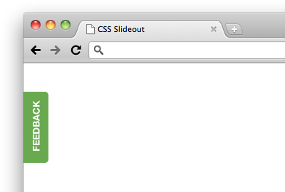
Let’s do the feedback form as an example. See the demo right here. Supports IE8+ (and IE7 too if the container div is changed to an anchor) and every other modern browser. The default state looks like this, a little green label on the side of the page:

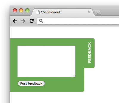
When you hover over it, a feedback form will slide out:

The markup
First, we’ll need the markup. Here’s what mine looks like, excluding the code of the form for simplicity:
<div id="slideout">
  <img src="feedback.png" alt="Feedback" />
  <div id="slideout_inner">
    [form code goes here]
  </div>
</div>
Essentially we have two divs. The one called “slideout” is the parent div. This is the div that will have the little “Feedback” label over which we’ll hover with the mouse cursor to expand the form. Note that right inside sits an image for the feedback label. I’m using an image instead of text to get a 90 degree rotation. This can be done with CSS3 now, but using an image in this case is simpler and provides better browser support.
Then we’ve got the “slideout_inner” div, which is the container for the form. It has to sit inside our trigger div for the CSS code to work, but its dimensions will span outside of its parent div.
The CSS
Here’s the magic. We’ll use pseudo-classes and the CSS3 transition-duration property for the slideout to work (I’ve excluded the unrelated styling code–see the demo source for full CSS):
#slideout {
  position: fixed;
  top: 40px;
  left: 0;
  -webkit-transition-duration: 0.3s;
  -moz-transition-duration: 0.3s;
  -o-transition-duration: 0.3s;
  transition-duration: 0.3s;
}
#slideout_inner {
  position: fixed;
  top: 40px;
  left: -250px;
  -webkit-transition-duration: 0.3s;
  -moz-transition-duration: 0.3s;
  -o-transition-duration: 0.3s;
  transition-duration: 0.3s;
}
#slideout:hover {
  left: 250px;
}
#slideout:hover #slideout_inner {
  left: 0;
}
What happens is the inner div starts with negative y-coordinates, hidden away by being pushed left out of the page. The trigger div with the label starts aligned left on the page. When you hover over the trigger div, it moves to the right the same distance as the width of the inner container. The inner container shifts to the right as well, exposing itself and its contents.
The transition-duration property sets the time duration for the transition, which makes the transition appear smooth on browsers than support CSS3. This basically animates the transition with a sliding motion, rather than simply triggering the div. If the browser doesn’t support this, it will still work, just won’t be animated.
How useful?
This can be a nice way of doing these sort of slide-out interfaces without having to write any JavaScript. The biggest problem with this is that of course a click is not required to activate the transition, so if the user indadvertedly hovers over the trigger div it will pull out the slider, which can be annoying. Also, there’s no easy way to set a delay before it closes, so as soon as you leave the area, the div will hide back, which again may not be the most usable solution. And of course we’ve got the problem of touch interfaces!
So there you have it, a technique for use as you see fit, just beware of the usability pitfalls.