I’m trying out a more visual time indicator in Usaura. Previously, times were displayed as simple text numbers. There was the shortest time, the longest, and the average:
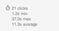
I didn’t like this because it wasn’t very visual. You can’t get a good feel for how long the clicks took just by quickly glancing at the text–you’ve got to read the labels and interpret the data.
I think a better way to show click times would be to plot them on a 60 second clock face. 60 seconds is enough for a click test, and plotting each click on the circle allows you to instantly get a feel for how long people took to click, similar to how a heatmap gives you an instant feel for click locations. Here’s the new indicator I’m trying out:
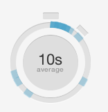
Every click is plotted on the clock face, with the adverage time shown in the center. Each indicator is also slightly transparent, gaining opacity as more of them overlap. You can try it out yourself over at Usaura. Have some feedback or ideas on this? Please post a comment below.