Linux… One of the problems with Linux is its lack of tasteful aesthetic. Linux seems to have always been designed by programmers–at least thats the impression I’m getting. It always tries, but it always falls short revealing its clumsy, unpolished edges. It’s getting better, but it’s not there yet.
One of the most glaring things that always pops out at me is a disregard for healthy whitespace. Whitespace: the empty space between one piece of content and another, or between that content and the edges of its bounding box. Whitespace helps you show hierarchy. It also makes things look so much less cluttered.
Here’s a screenshot from the latest release of Linux Mint. Check out the menu bar at the bottom of the screen:
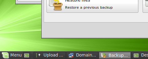
The font size is probably a point too large, but that’s not the worst issue here. The worst issue is just how cluttered the menubar is. It’s cluttered because there’s not enough padding between all the elements and their bounding boxes.
I’ve booted up Photoshop and had a go at cleaning it up. Here’s what I’ve come up with:

First of all, I increased the height of the menu bar. You have to sacrifice some screen real estate if you want an uncluttered interface, there’s just no way around that. A few pixels more can’t hurt.
I’ve then decreased the font size by a pixel or two. This in turn automatically increases the whitespace around the text because it’s now smaller–it gives it more padding. Finally, I merged the button edges together, eliminating a bunch of duplicate lines. This again simplifies things and frees up more space.
Note that even though the conents in the menubar now have a healthy amount of whitespace around them, the same amount of content fits in horizontally–even a little bit more (note where the word “Desktop” cuts off). More whitespace doesn’t hurt.